“The best design tool is a long eraser with a pencil at one end.”
 As you might have noticed from today’s newsletter, we’ve recently spruced things up a bit. Or should we say spruced things down? Based on reader feedback, we decided to make some design changes which make the newsletter easier to read, faster to load, and a little more mobile-friendly for everyone.
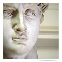
Good design, as Marty Neumeier implies in the above quote, is not so much about adding elements as it is about taking elements away. Like Michaelangelo supposedly said: “The sculpture is in the stone… I just removed what wasn’t the sculpture.” Indeed, in a world which seems more and more crowded, the art of subtraction may be the most valuable art to learn.
This is also a concept worth considering when you help your clients navigate the home buying or selling process. While we all understand the value of client communication and keeping all parties in the loop, where might you simplify or protect your clients through the art of subtraction? How do you distill to the essential, and not overwhelm them with every inch of the process?
Information overload is often referred to as a problem of bad design. Like a map too rich with detail, too poorly drawn, its very function can be undermined by its good intentions to help you get where you’re going.
Where can you reduce noice? Where is there an opportunity to say more with less?


